

Growth Experiments - Volvo On Demand
Swedish car sharing app with a sustainable focus.
The context:
The growth team conduct experiments to test hypotheses that will impact our KPIs and support our LTOs. The results are used to guide new features, products and services.
We look at things like:
Price sensitivity
Incentives
Retention
Referrals
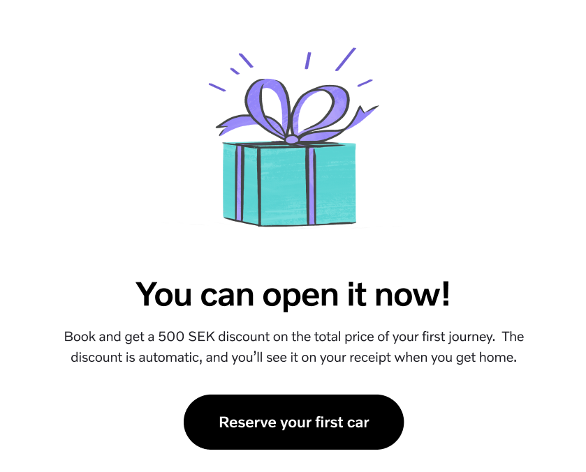
In this example, we knew that our monthly subscribers were confused about our Premium service. Either the benefits weren’t clear to users or their awareness was low.
We wanted to promote Premium by focusing on one particular benefit; flexibility (discount returning early).
Challenges: finding the balance between playful and effective. My colleague’s ideas were a guide. She knows our users well because she interviews them all the time.
How: I knew the target audience (monthly subscribers) belonged to specific archetypes.
Not new users, Familiar with the app, even if they didn’t know much about our Premium service.
We could afford to be a little bit more playful than usual.
I wanted to give my colleagues a different few options that were conversational and positive.
What I did: headline variations for the experiment (delivered via email, with booking confirmation).
Outcome & Impact: although my version led to a tiny increase in conversion, the results were statistically insignificant. There were several variables, and it was not possible to track click-through (only conversions).
It’s also possible that the benefit just wasn’t important enough to the user.


Why I’m showing you: this project is data-driven and combines copywriting with UX. Even though the results were not significant, it demonstrates my iterative approach to problem solving.
Soft skills: collaboration, creativity, humour, cross-functional teamwork.
Hard skills: UX writing, copywriting (based on data).
Frameworks: persuasion (Cialdini, humour and receptivity).
Colleagues: 2 x product designers, 1 UX researcher (Customer Experience), 1 product manager.


My copy was part of a much larger process, and my colleagues had written some good starting points:


I wrote 3, 2-line titles with 2-line descriptions (70 characters max). The existing visual design was based around this format, and it was working well. I treated each title as a headline. I wanted it to be sticky.

I used a variety of rhetorical techniques to mix up a few verbal cocktails. The audience were highly educated English speakers (International):
Direct address (personal)
Ellipsis (curiosity)
Question mark (personal)
Humour (ego stroke)
Tropes/ incongruence (pun on the well known idiom “Time is money.”)


Lessons:
You can’t expect everything you do do have a measurable impact, but it’s fun when it does.
How can writers quantify and communicate the value of words? Nice to run this as a multivariate test with with click-tracking.
A good reminder of how testing can help us to refine our offers based on their actual relevance to customer need. If customers don’t care about early returns, we can change our focus.
"Nath is incredibly collaborative and professional. His aim is always to help the team."

Haz Roth, Associate Design Director, Volvo On Demand