


UX Writing - Volvo On Demand
Swedish car sharing app with a sustainable focus.
Why I’m showing you: this project is an example of UX writing in a data-driven team. It was a test.
Soft skills: empathy, collaboration, stakeholder management.
Hard skills: UX writing (based on data), Figma.
Frameworks: Peter Morville’s UX Honeycomb.
Colleagues: 1 x product designer, 2 x UX researchers, 1 product manager.
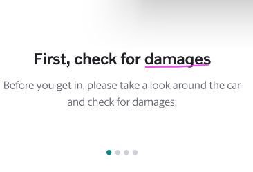
The context: before customers use a car, they need to check for existing damage. If they find or cause any damage, they need to report it in the damage log. To help customers we have the damage guide.
This whole process needed to switch from Intercom to native. This test is part of that switch.
Users weren’t happy with any of this process. It also created problems for Finance and Legal.
Customers who didn’t report damage, became liable later.
Finally, the customer didn’t know they were only liable for damage over 10cm in diameter.
We wanted to test: will a more helpful guide lead to happier users who report damage more often?

Outcome & Impact: we created a different variant to that directly addressed the customer pain points (time clarity). This solution is now live.


The existing flow put pressure on the user. Completing this task is unpleasant, but mandatory if you don’t want to be accused of damaging the car.
What we did: my colleague came up with a new, simplified flow that used a credit card as a visual cue for damage reporting (genius). This reduced the guide from 4 to 3 screens (plus the nudge). I rewrote it.


My design colleague had written placeholder copy for each screen, but agreed that it needed some work (incl. typos):
Use of imperative language (“need to”). This phrasing was adding emotional friction to an already unpopular process. Titles could be friendlier without losing the sense of personal responsibility.
No mention of checking tyre damage which would have been a serious safety hazard. Nobody had thought of this.
“Don’t worry about minor scratches” was nice. It echoed the user frustrations from the qualitative data, and could set the tone for the next iteration.


How: we took the role of different stakeholders:
the user hurrying to get on with their life
the damage handling team, stressed with the extra work
the legal team worrying about liability
Here’s an illustration of our approach using the UX Honeycomb.


Challenges: none.
Reminders:
Designers have a diverse skillset. Yes, this colleague might be reworking the colour palette of the UI, but they also write poetry, carve wooden spoons or play in a Nordic battle-rock-band.
We inhabit multiple worlds, and we bring those worlds with us to work. Let’s use them!
Outcomes are always stronger when we collaborate. The best ideas get better and the weak ones are improved.
"Nath is great at distinguishing subtle differences in the English language. He also knows UX and UI which makes him very easy to work with."

Carolina Bertlisson, Product Designer, Volvo On Demand