

UX Writing & Copywriting - Volvo On Demand
Swedish car sharing app with a sustainable focus.
Why I’m showing you: this project demonstrates my process. It combines copywriting with UX, and involves lots of communication, compromise, and stakeholder management.
It was a success, but not in the way I expected.
Soft skills: collaboration, stakeholder management, cross functional-teamwork
Hard skills: copy editing, UX writing, copywriting (based on data)
Frameworks: Design Thinking, persuasion (Cialdini, matching effects).
Colleagues: 2 x product designers, 2 x UX writers, 1 x brand copywriter, 3 x product managers.
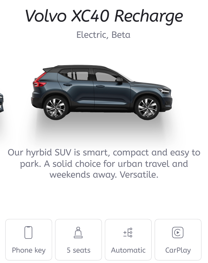
When I had a clear picture, I checked Volvo Cars to see what they were doing. Here’s an example (XC40):


The final filter were the tone of voice guidelines. We’re owned by Volvo, but we’re not Volvo. We have things in common (we’re safe, and trustworthy), but we’re younger, and less formal.
Less boring actually. And that’s the point.
Challenges: I collaborated with colleagues in Marketing and Design to get feedback. After a few iterations we were ready to update the designs.
That’s when I ran into a blocker. There wasn’t consensus on what to call each model, or how to describe its fuel type. The existing taxonomy was confusing for everyone (probably more so for users).
It created quite a big debate which began to soak up time.
How: I started by trying to understanding the users, specifically how and why they use the app. This meant reading the customer archetypes, and cross-referencing that data with the features and benefits of each car.

Young families don’t need to know about speed and style. They want to know about safety, convenience, and storage space. They’re practical.
Urban friends want weekend adventures with luxury. They need to know about storage and versatility.
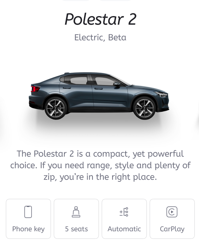
What I did: one description for every car that amplified relevant value and differentiators.
Volvo don’t dictate to us, and we have the freedom say things how we like (within reason). However, I felt it was important to provide some brand continuity.
I knew that part of our growth potential comes from existing Volvo users. These people lease, long-term and they’re ideal candidates for our monthly subscription (or a competitor).
How would they feel about the copy if they were thinking of making the switch?
It had to be Volvo, but also Volvo On Demand.


Writing: I worked to a frame of 3-lines, and 120 characters.


Outcome & Impact: my copy was not featured in the app due to the above blockers. However, Marketing did use it for the main website (with some changes to fit their style).


The discussions were useful because they helped me to get to know team members in other departments. They also highlighted some of the common communication challenges around closely related technical products:
How do we name products so their value is intuitive (Ford Cougar vs XC40 Hybrid)?
How do we differentiate similar products?
How can we focus on user benefits rather than features?


Lessons:
Strong foundations are flexible. When we build content around the user and the OKRs, the content becomes intuitive and scalable. This increases efficiency for all teams.
Divisive issues are a chance to further discussion. This leads to greater understanding and visibility. When you can see it, you can solve it.

Context: there were no existing product descriptions in the app (or online). Cars were arranged in a slider with an image and model number.
There was an opportunity to amplify the benefits, and help the user to choose the right car faster.
My predecessor had written some good starting points, but they were incomplete, and didn’t reflect the copy from our parent company, Volvo Cars.

“Nath's openness and approach to collaboration is inspiring. Personally, I really like Nath’s "What if…?" and "How might we…?" approach to collaboration. Putting the work out in the open, listening to feedback and iterating.”
Petter Silvfer, Chief Design Officer, Volvo On Demand